Notes on Bringing an Old Local Soda Back to Life
There is a particular sound that belongs to Turkish summers: the metallic pop of a crown cap coming off a glass bottle, followed by that short hiss of carbonation escaping into hot air. It usually happens outside a bakkal, the small neighborhood shop, where the gazoz sits in a fridge that hums a little too loudly.
If you didn't grow up with it, gazoz can look like a lesser cousin of the global soda giants. But in Turkish daily life, gazoz occupies its own cultural register. It's tied to summer holidays in provincial towns, to grandparents' kitchens. These drinks carry geography inside them.

This is what made the project interesting to me as a designer, and honestly as someone who's a little too fascinated by everyday objects: gazoz sits at the intersection of industrial production and folk memory. It was mass-manufactured, but it behaves, in people's minds, like something homemade. Rebranding it meant respecting that contradiction instead of trying to iron it out.
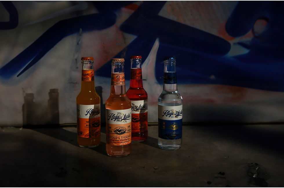
The identity I designed leans into a much more classical hand-lettered script, with the kind of sweeping flourish you'd associate with a 1930s soda fountain sign or an old barbershop window. It doesn't try to look new. It leans hard into the idea that this brand has history.


The label as a small landscape painting
Let's talk about the name for a second, because it's kind of a great joke. "Kayısı Kola" is almost certainly a nod to Coca Cola, same rhythm, same "Kola" at the end, except somewhere along the way, someone swapped in kayısı (means apricot in Turkish), the single most famous thing to come out of its homeland (Malatya, the apricot capital of the country), the city where the brand was born. And the actual punchline is despite the name, the drink itself is basically never apricot-flavored. It's usually slightly lemon at the original one.
The label carries a mountain silhouette rendered in fine gold linework. The mountain isn't decorative filler, by the way, it's Malatya mountain, so the label is basically saying "this has a hometown" at the same time.
I also worked with the idea of using label color to signal flavor, so the packaging system reads almost like a little family resemblance, a shelf of Kayısı Kola variants would look like siblings rather than strangers, distinguishable at a glance.
As for the glass bottle shape, I'll admit this one is partly a private wish rather than a finished victory. The original, slightly stubby old bottle isn't something we can just get our hands on and reproduce anymore; that specific mold is basically gone. And the glass bottle industry here, unfortunately, has pretty limited options to begin with, it's not like picking a font.

Rebranding a business brain
The actual goal behind this rebrand was pretty concrete: take a small, very local, slightly under-the-radar brand and give it a shot at reaching a bigger audience, ideally in a more premium segment than "regional soda nobody outside the region has heard of."
Premium doesn't always have to mean cold or foreign-feeling, sometimes the most premium move a heritage brand can make is simply taking its own story seriously enough to design for it properly.
Projects like this come with a challenge that's really their own. You're not just designing a nice-looking bottle, you're negotiating with someone else's memory, trying not to break something that was never really yours to begin with. But that's also exactly why they're worth doing. Done carefully, a small rebrand like this doesn't just sell more soda, it adds a little weight back to a piece of local culture that might otherwise have quietly disappeared without anyone writing it down.
You can see the full visual identity on my Behance.